You’ve chosen the restaurant, browsed the menu, and finally placed your order. But how much of that decision was truly yours? While you were pondering the steak or the salmon, a silent influence was already at work, shaping your cravings, your mood, and even your pace, all through the power of color psychology.
Restaurant designers and marketing experts wield color psychology like a secret weapon. The palette they choose is never an accident; it’s a strategic tool designed to create a specific experience and drive customer behavior. Let’s decode the hidden messages on the walls, plates, and menus.
This is the most iconic example of restaurant color psychology in action. Walk into any major fast-food chain—McDonald’s, Burger King, KFC, In-N-Out—and you’ll be greeted by a familiar blast of red and yellow. This isn’t a coincidence; it’s a meticulously chosen strategy designed for speed and profit.

Here’s the breakdown of why this color combo is so effective:
- Red: The Urgency Trigger. This primary color is a powerful stimulant. It’s known to:
- Increase Heart Rate & Blood Pressure: This physiological arousal creates a sense of excitement and energy.
- Stimulate Appetite: It triggers a hunger response, making those pictures of food on the menu look even more appealing.
- Create a Sense of Urgency: Red subconsciously signals “fast” and “now.” It encourages quicker decision-making and faster eating, which is crucial for high customer turnover. You’re not meant to linger in a bright red booth for two hours.
- Yellow: The Beacon of Happiness. This bright, sunny color complements red perfectly by:
- Grab Attention: Yellow is the most visible color from a distance, making the restaurant’s signage easy to spot from a busy street or highway.
- Evoke Feelings of Happiness and Optimism: It creates a sense of warmth and friendliness, making you feel good about your choice. This positive association builds brand loyalty.
- Trigger Impulsivity: The cheerful, energetic vibe encourages spontaneous decisions—like adding that extra shake or order of fries.
Together, this dynamic duo is a neurological powerhouse. Red gets you excited and hungry, while yellow makes you feel happy and impulsive. This combination is scientifically proven to speed up service, increase appetite, and ultimately, drive more sales. It’s the ultimate palette for efficiency and fun, perfectly engineered for the fast-food business model.

Now, picture a high-end, white-tablecloth restaurant. The color scheme is almost entirely different: think soft neutrals, deep blues, earthy greens, and muted browns.
- White, Beige, and Grey convey cleanliness, sophistication, and luxury. They create a blank canvas, but not a passive one. These colors are psychologically calming and slow the heart rate. They encourage you to relax, stay a while, and—crucially—focus on the main event: the food. In a neutral environment, the colors on the plate pop, making every dish look more vibrant and Instagram-worthy.
- Dark Blues and Greens are associated with trust, stability, and premium quality. They are calming and conservative, often used in steakhouses or establishments that want to project an image of reliability and elegance.
This palette is designed for dwell time. The goal is to make you feel comfortable, unhurried, and willing to indulge in multiple courses and a bottle of expensive wine.
The Unexpected Curb: The Appetite Suppressants
While some colors encourage eating, others actively suppress it. This is why you will almost never see a restaurant painted entirely in blue or purple.
- Blue is the ultimate appetite suppressant. Why? There are very few naturally blue foods (blueberries are purple, and blue cheese is, well, an acquired taste). Our evolutionary wiring associates blue with potential poison or mold. Studies have shown that people eat significantly less food served on a blue plate. Some weight-loss plans even recommend using blue plates for this reason.
- Purple can be seen as artificial or exotic. While it conveys luxury and creativity in small doses, large amounts can feel unnatural in a food context, having a similar suppressing effect as blue.
You might see these colors used as accents in trendy, avant-garde establishments aiming for a “cool” or unconventional vibe, but they are rarely the main event.
Beyond the Walls: The Color on Your Plate
The psychology doesn’t stop at the decor. The most important color story is told on the plate itself.
- White Plates: The industry standard for a reason. White provides the highest contrast, making the colors of the food appear more vivid, fresh, and carefully composed. It’s the chef’s perfect canvas.
- Black Plates: Creates drama and sophistication. It makes bright, vibrant foods like saffron risotto, beetroot, or fresh greens look incredibly striking and modern.
- Earth Tones (tan, brown, green): Often used in “farm-to-table” or organic restaurants. These colors convey a sense of natural, wholesome, rustic authenticity.
The Next Time You Dine Out, Look Around
Before you even glance at the menu, take a moment to absorb the room. Are the walls a frantic red, hurrying you along with a side of fries? Or are they a calming beige, inviting you to sink into your chair and savor every bite?
The choice of what to order may feel like yours alone, but from the moment you walk in, the room has already been speaking to your appetite. All you have to do is listen.
Stay Connected:
https://www.instagram.com/executivewomen_
https://www.facebook.com/ExecutiveWomen
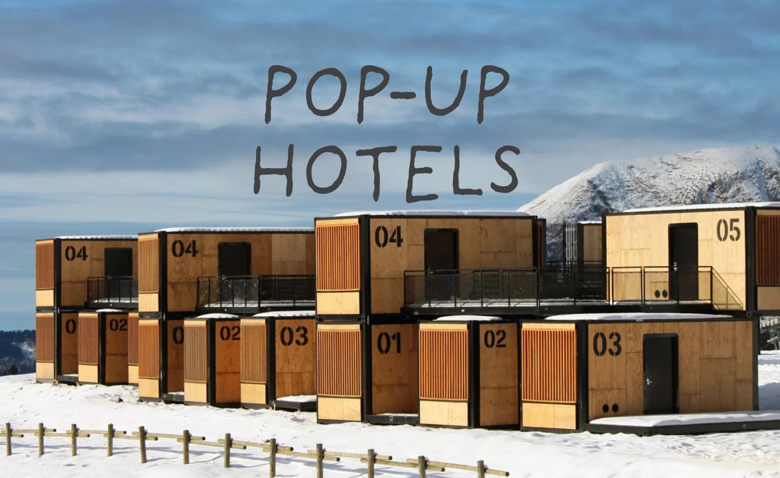
Read more articles: https://executive-women.global/en/top-5-pop-up-hotels-in-the-world/